Bird is a cloud communications platform.
They enable businesses to communicate with their customers through a variety of channels such as WhatsApp, Email, and SMS. Bird provides a suite of tools and APIs that allow businesses to integrate messaging capabilities into their applications, websites, systems, and payments easily.
Bird needed a new promotional video to reveal their Marketing Automation platform.
They want to present its versatility so I needed to break down its complexity in a way that viewers could digest. At this point, Bird's product videos looked like tutorials, which did not communicate our service effectively. The solution was a short high energy video showcasing Bird’s marketing solutions in a powerfully minimalist way that is more engaging than their previously subtle content.
The intended audience for the video is Marketers.
We want to show them how Bird can automate a customer’s experience through sign up forms, chat support, and payments. The goal is to generate leads to signing up with Bird and spread awareness of our all-in-one product.
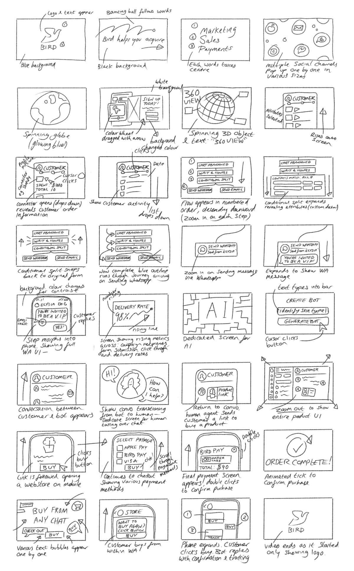
To accompany a script, I sketched a storyboard to aid art direction.
This would also give the motion designer in my team clear direction. I spearheaded the project and designed the concept, directed the video, and guided our motion designer. I provided assets and decided exactly how information needed to flow.. A big challenge was keeping the video no longer than a minute and a half. We initially had almost 5 minutes of content which was meticulously cut and tailored to deliver Bird’s message faster.
The next step was creating the supporting visual assets.
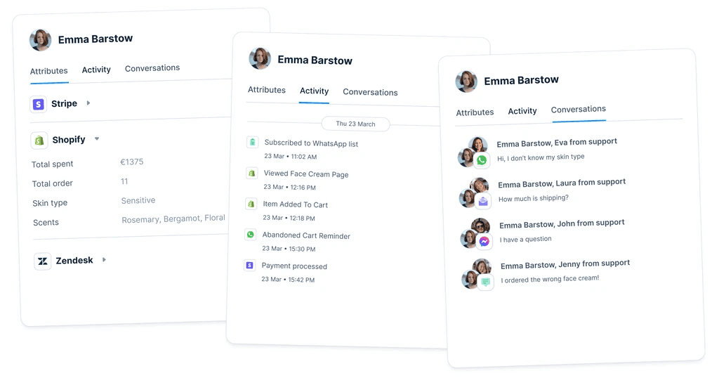
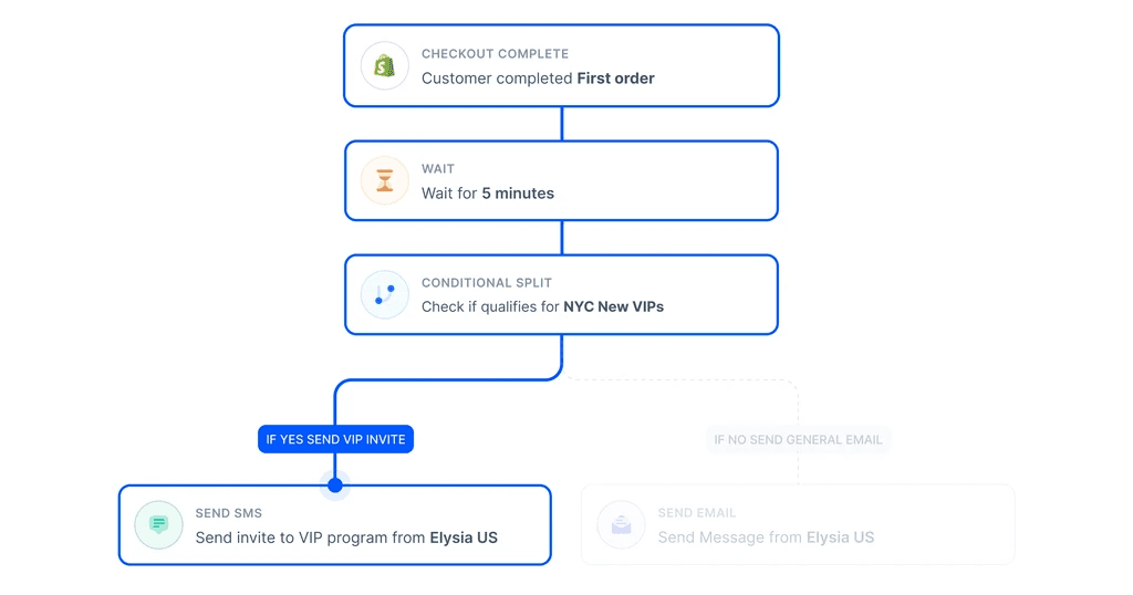
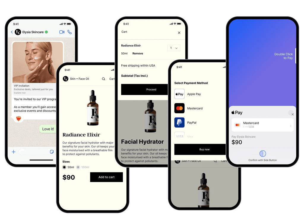
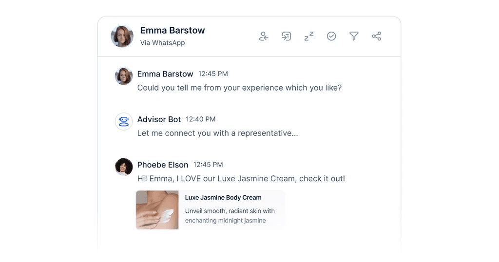
Once the script was approved, I translated each screen into assorted vectorised assets ensuring consistency across image clarity, brand fonts/colours, line weights, drop shadows, and curvatures. I created the fictional brand 'Elysia Skincare' to demo Bird's product in a realistic user journey. I knew this would be the best way to clearly showcase Bird's value in a believable and personal way, effectively reminding customers of our relationship with our clients.
My visual direction need justification.
The stakeholders originally wanted to show the full UI of Bird’s platform. My visually minimal approach was a hard sell because the stakeholders wanted to be very literal by showing the entire product. The biggest problem I saw here was the video falling into a previous trap of becoming a tutorial over a snappy and exciting introduction to the repacking of Bird.
Visual elaborations can quickly become overwhelming without an intentional focus point. To avoid derailing the video I walked us through both paths comparing their approaches. With each slide only appearing on screen for a second or two, and the challenge of limited time, the minimalized route was more practical in rapidly delivering their message.
The result.
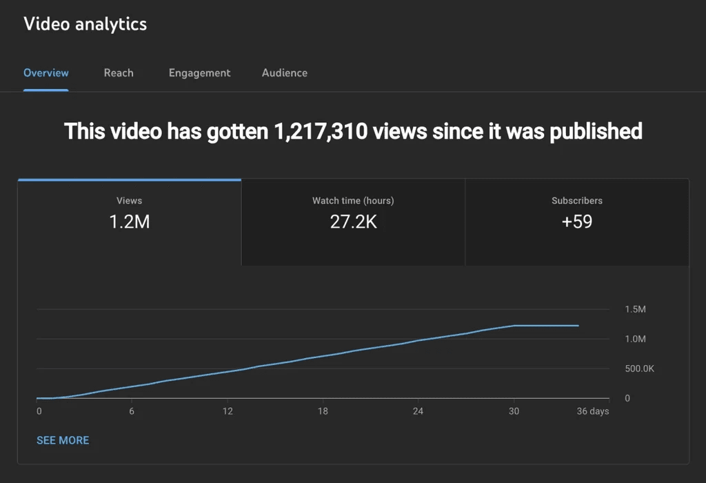
The video was a massive success as it reached over one million viewers at launch. Leads increased, as well as social engagements as the video took a prime position on Bird’s rebranded homepage. The video is also being used on Bird's Shopify page, within sales pitches, and in on-boarding processes for new hires.
Due to its success I further brokedown the video into even shorter bite sized 10 second snippets to push various social posts for more specific and persistent engagement. The video's overall aesthetic is now solidified within Bird’s style guide documentation to demonstrate Bird can confidently continue creating direct video content with this proven formula.
© Ashley Evans 2024