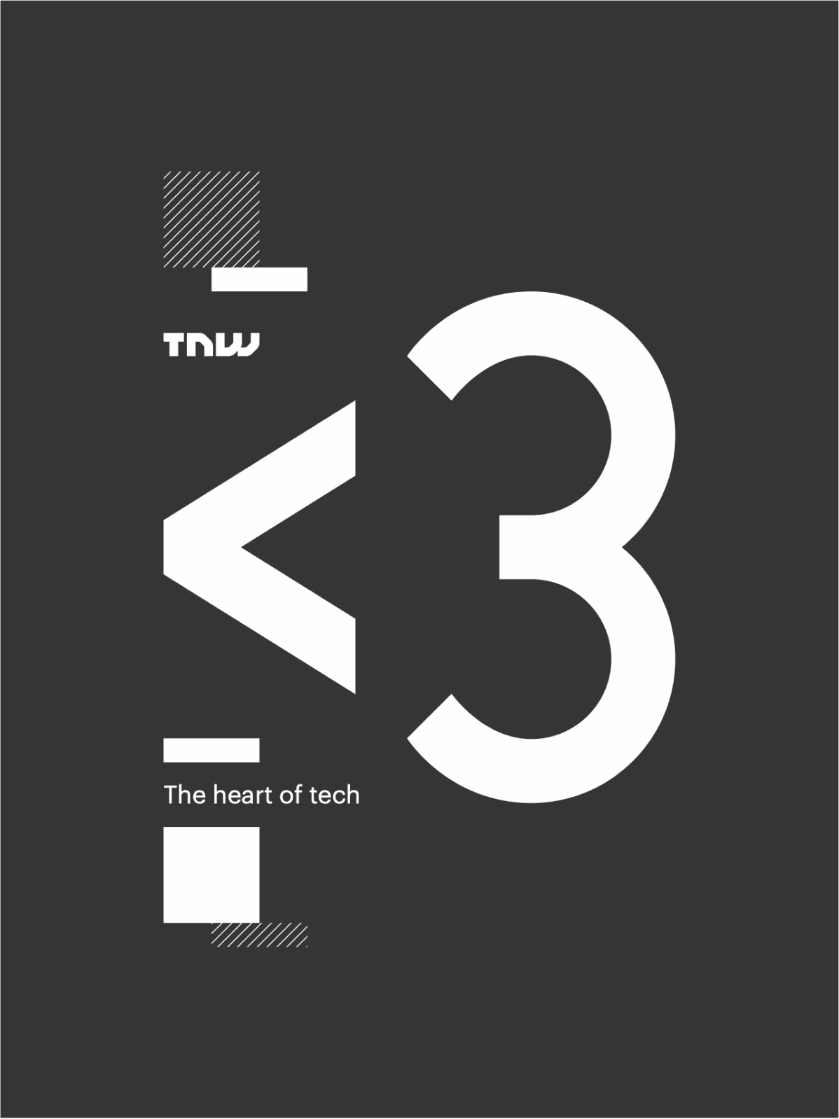
The Next Web (TNW) is a media company and technology-focused online publication.
TNW covers news, insights, and trends in the tech industry. TNW's primary focus is on technology, innovation, startups, digital culture, and most importantly their annual conference which takes place in Amsterdam, Netherlands.
The Next Web needed a strong eye-catching brand.
The brand had to appeal to both young creatives, and cooperates. To accompany illustrations, they also seeked modular assets to work across a landscape of both digital and printable assets for their annual conference. Yielding over 20,000 visitors a year TNW stands as Europe’s biggest Tech conference which takes place in its home city of Amsterdam.
To achieve this I broke the project down.
I set out to complete three objectives. One, to explore and develop a vibrant colour palette to revitalise TNW’s to apply across the visual assets. Two, to Create diverse illustrated characters, celebrating individualism and gender neutrality. Three, develop a visual language of modular shapes to support all visual assets
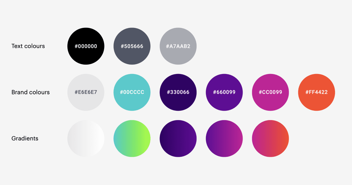
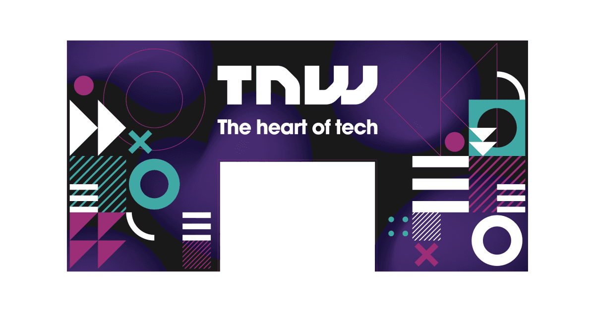
I began with exploring a new choice of brand colours.
TNW’s original colour palette consisted of just white and red. I didn’t want to abandon the colour red and felt it worked as the seed to the continuity of expanding their colour library. To continue the desired theme of vibrancy and a loud tone of voice I opted for a channel of strong contrasting colours.
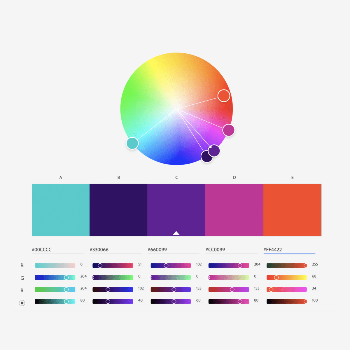
Black, blues, and purples firmly harmonize lighter gradients and avoid any sacrifice to readability. The expanded colour library also doubled as a vessel in creating a diversifying playground for the upcoming illustrations and visual language.
Next I implemented illustration.
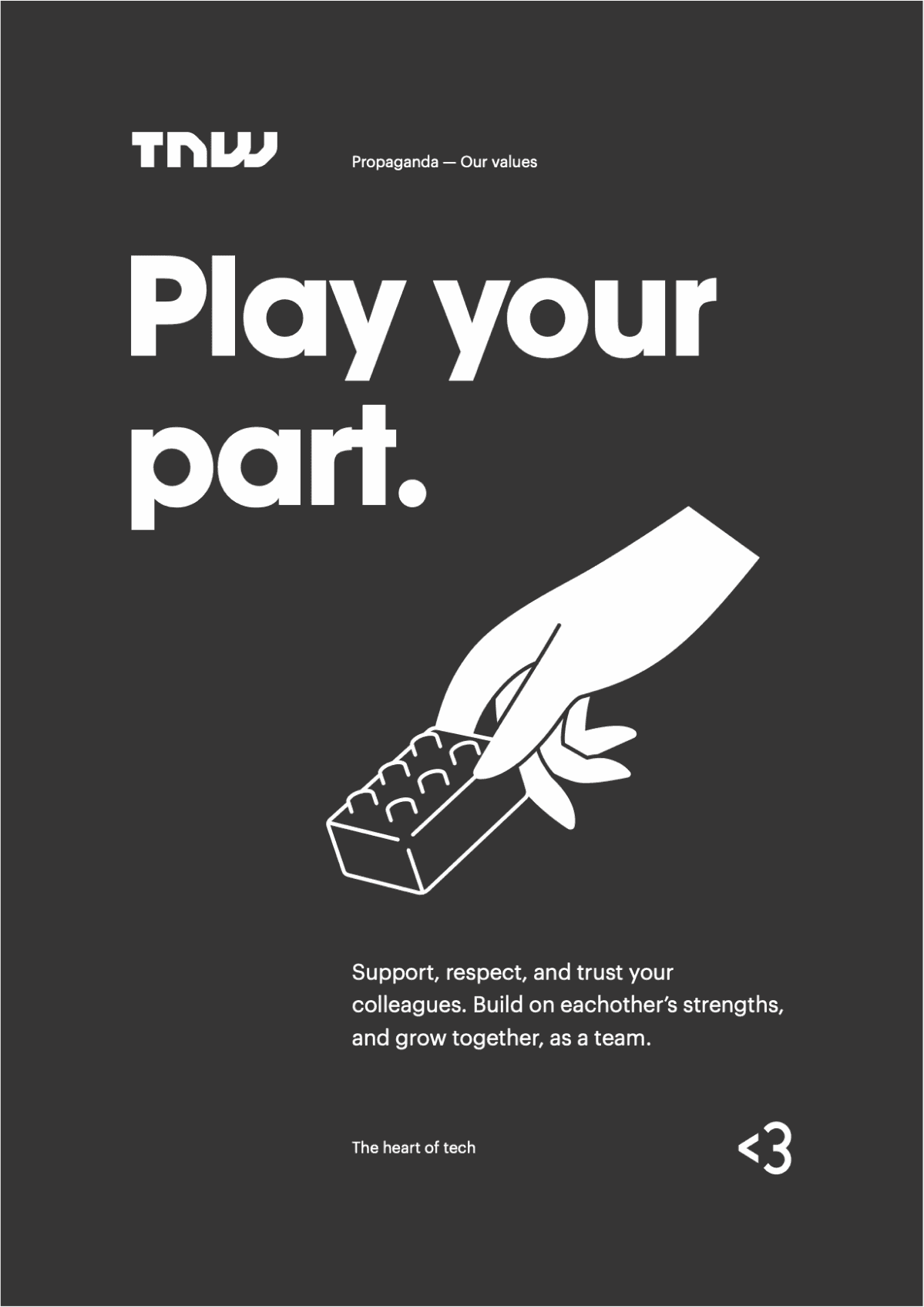
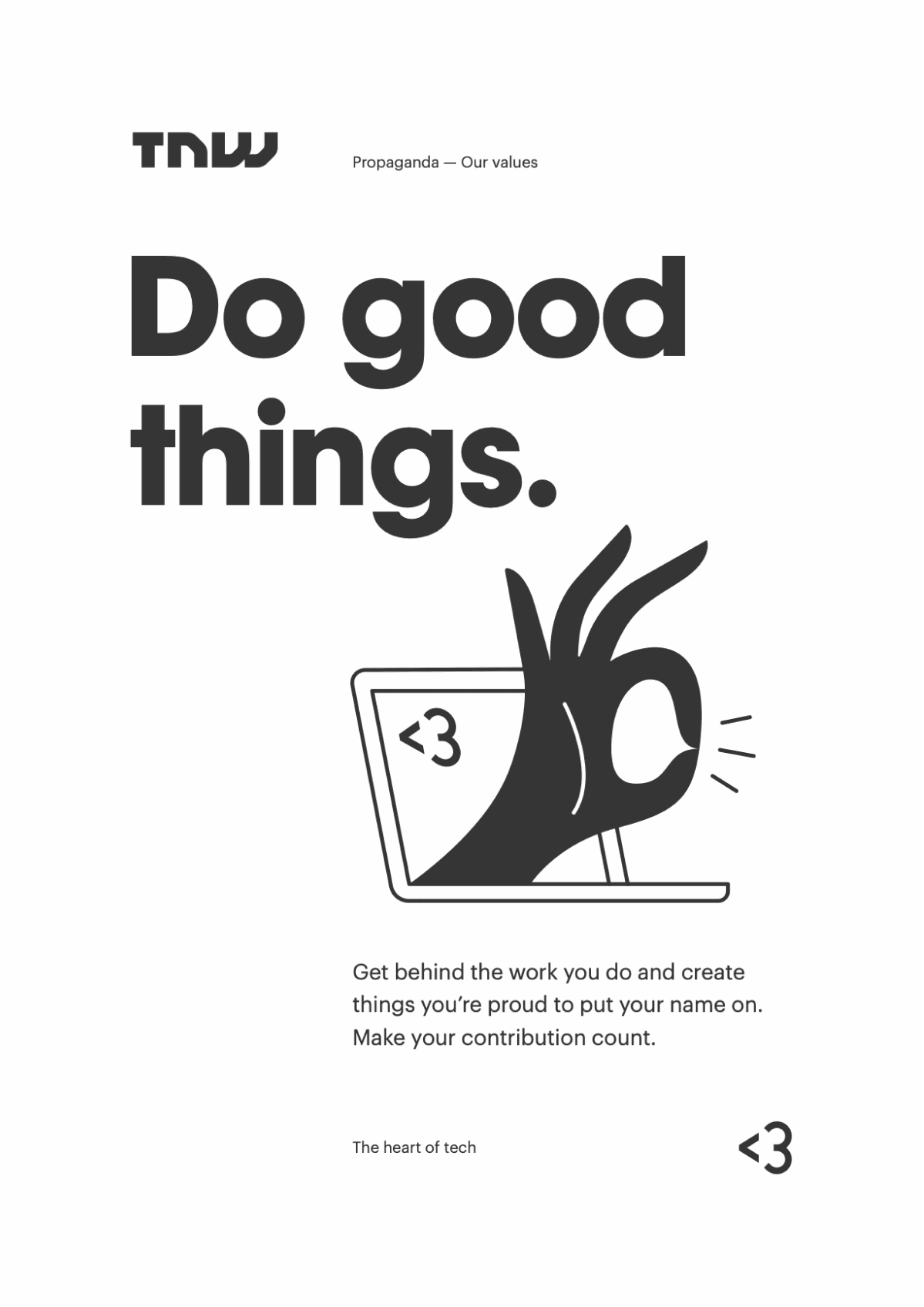
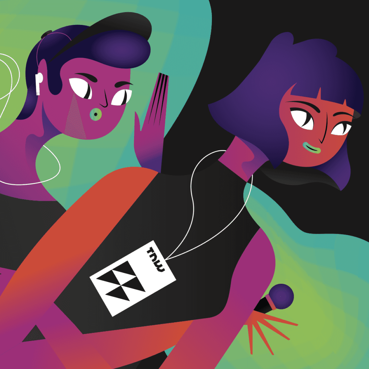
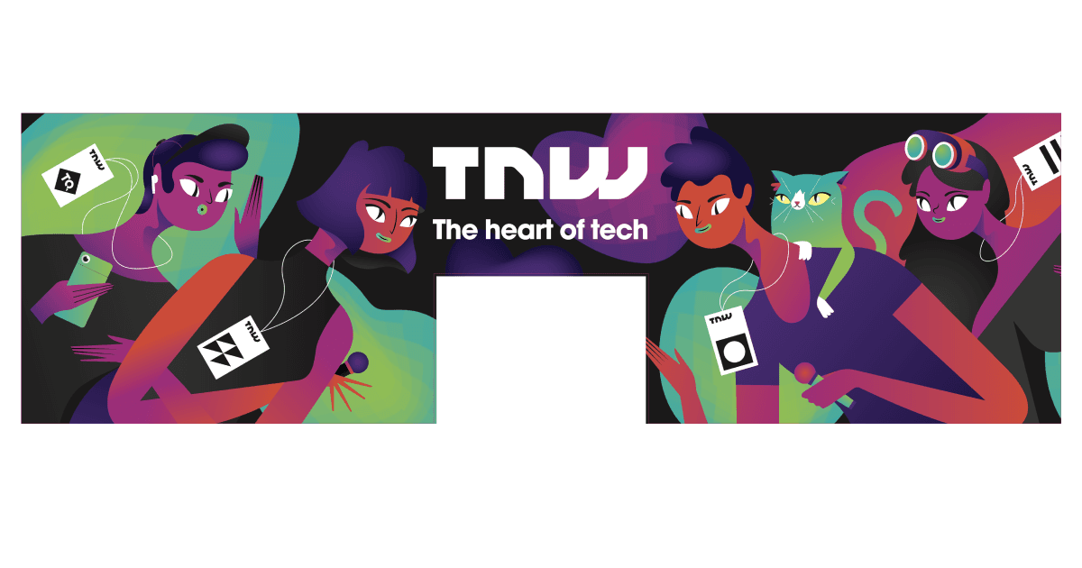
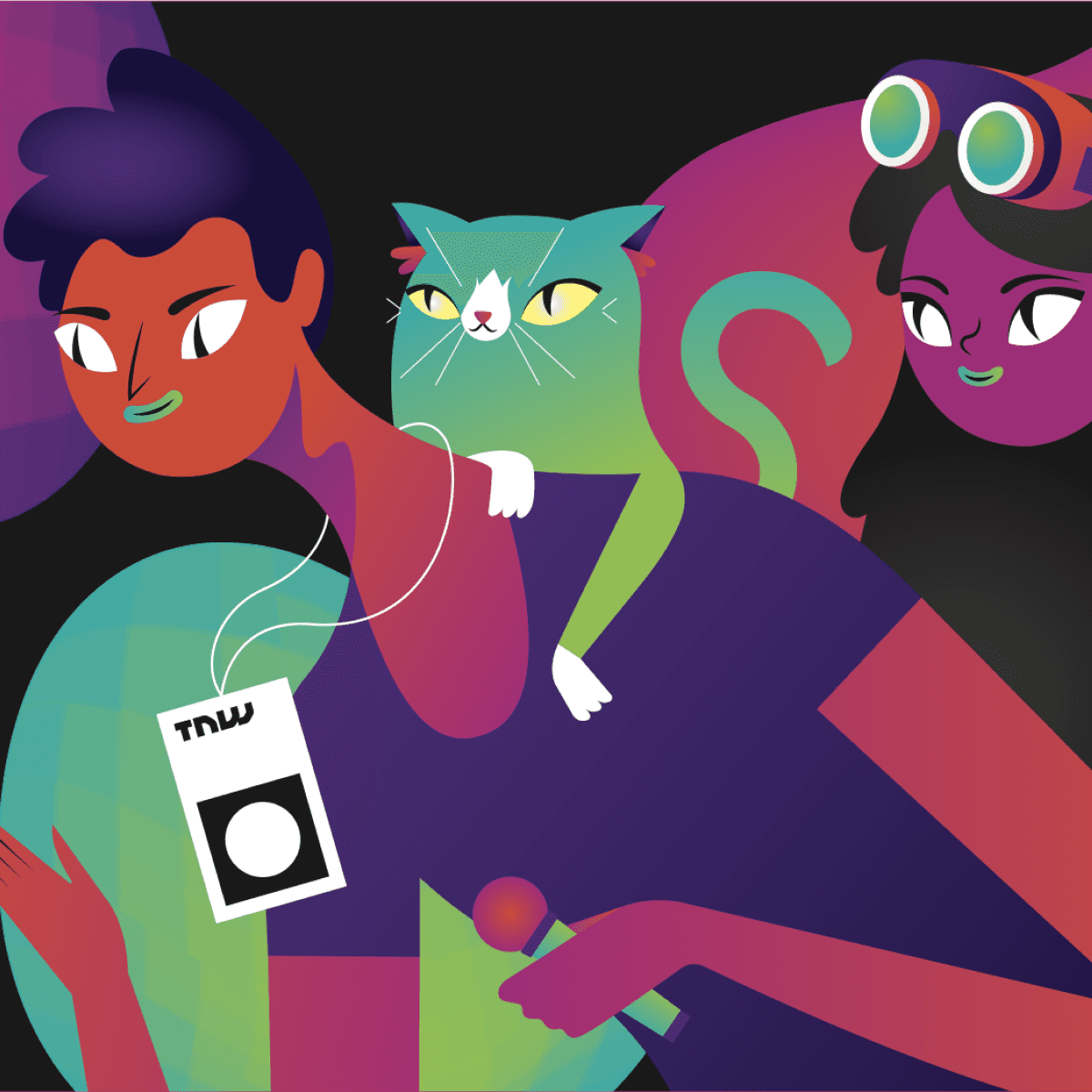
TNW requested illustrations which celebrated people coming together and to be a direct reflection of the conference itself. I opted for illustrating abstracted characters from their previous event’s guests and speakers. The simplicity was a strong aid in approving the illustrations concept with management.
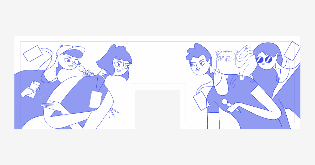
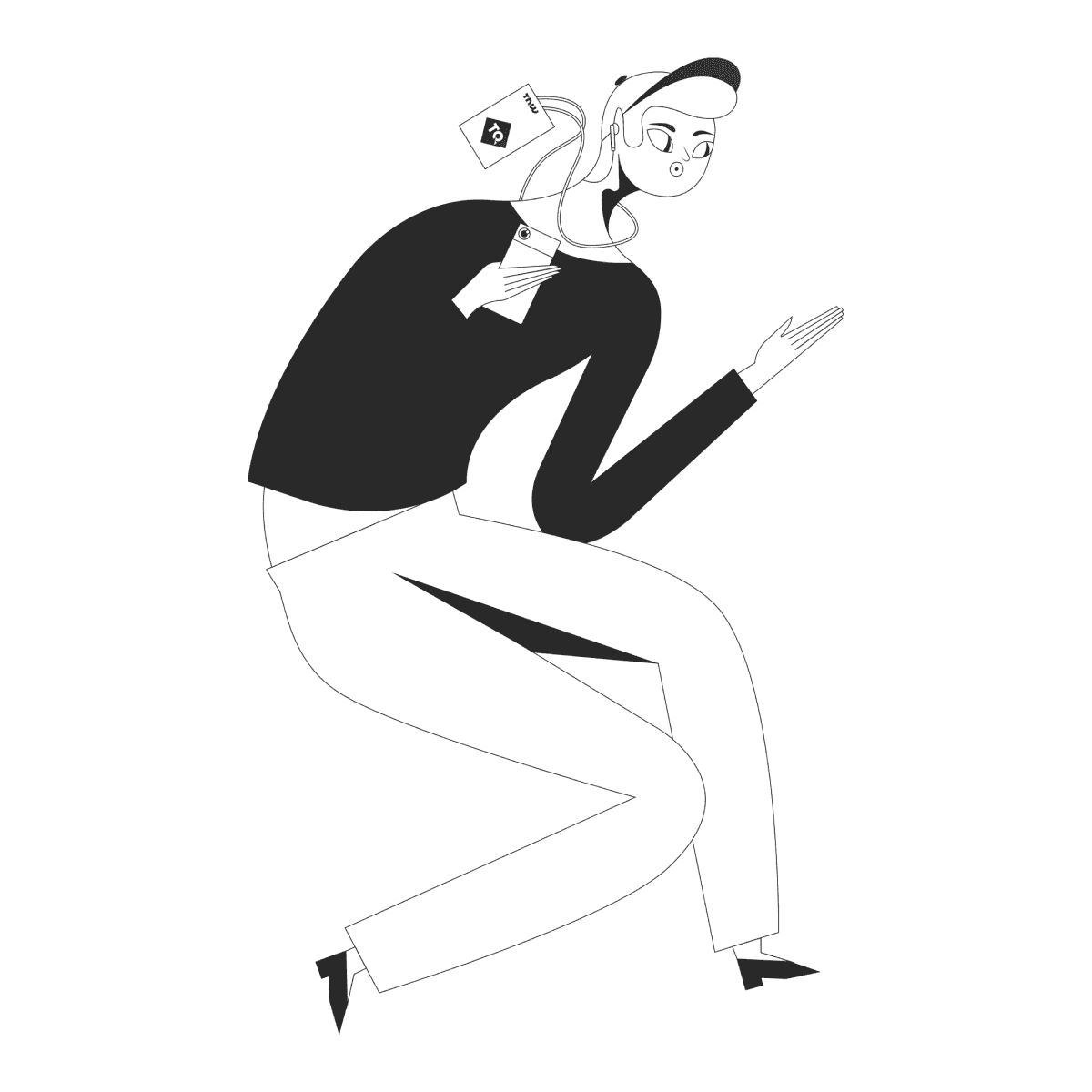
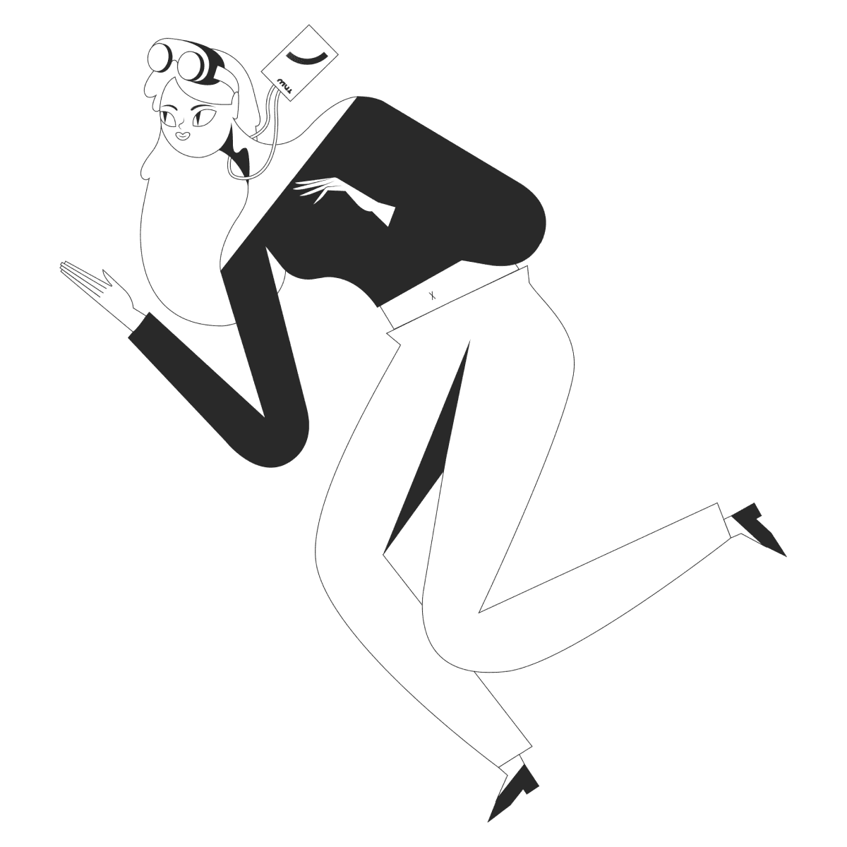
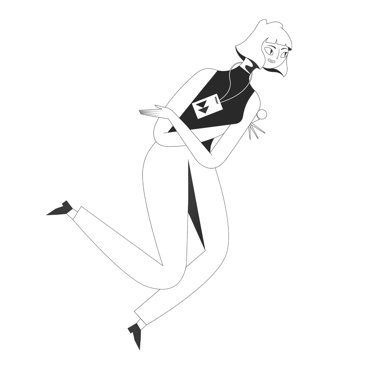
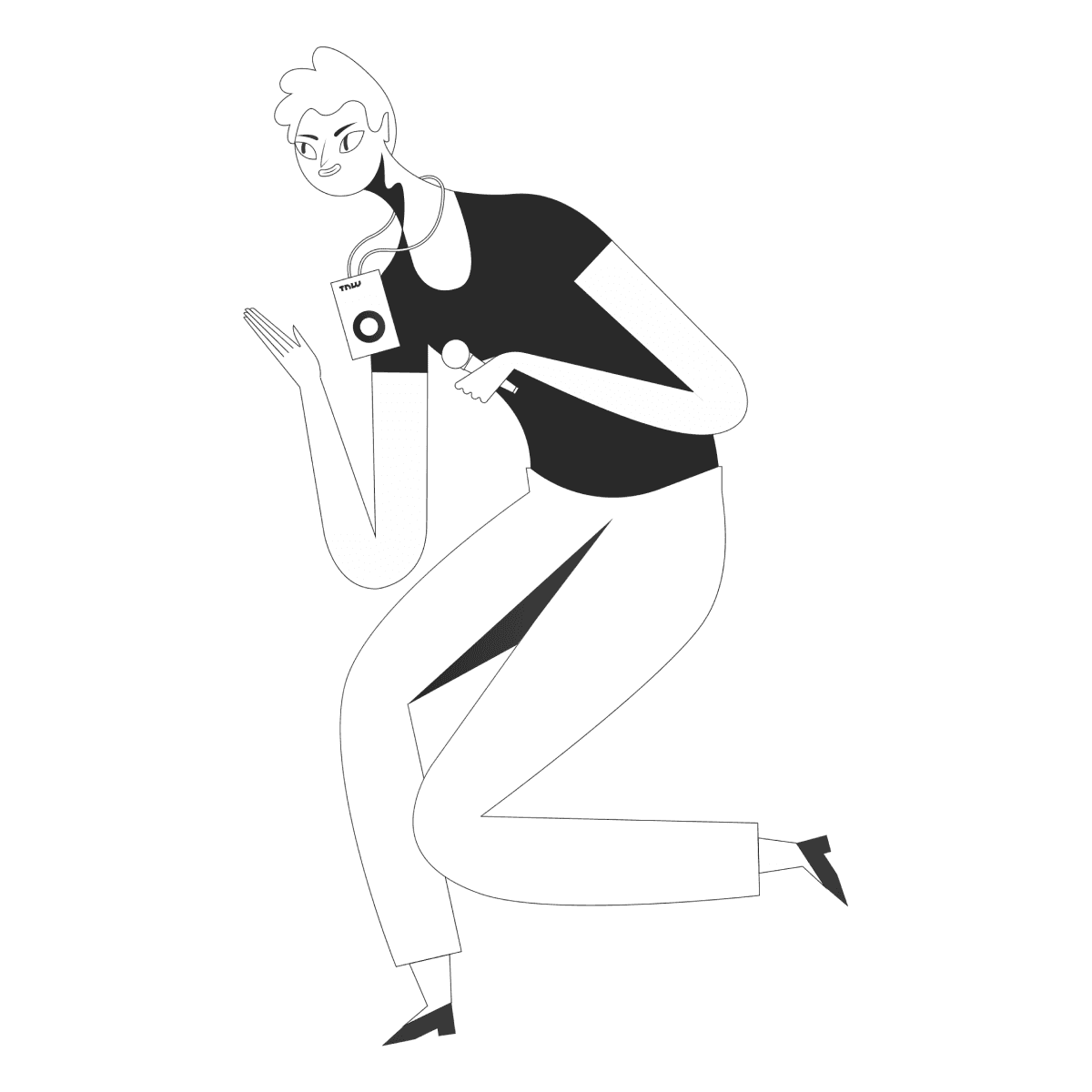
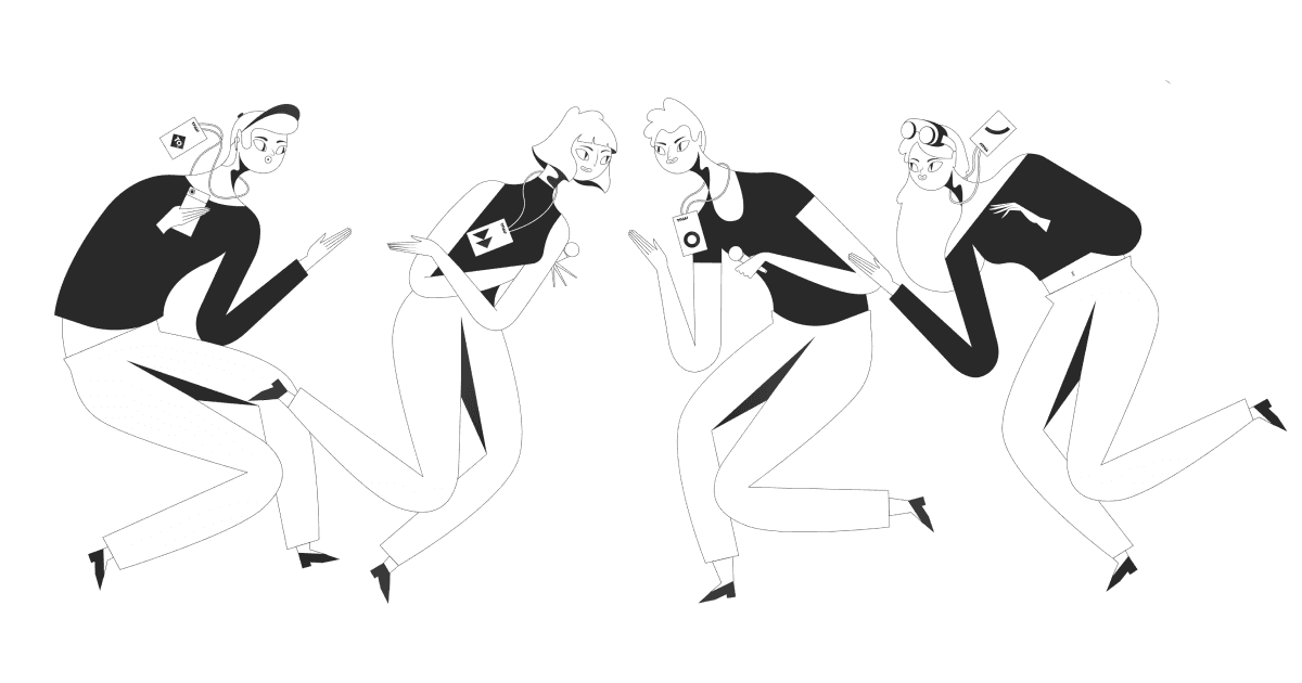
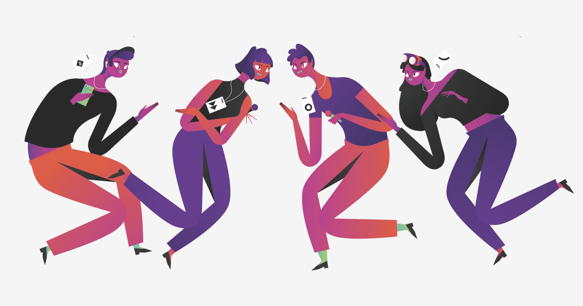
I deliberately used abstracted skin tones with the new colour palette to portray diversity in a broader and more inclusive manner. Rather than limiting representation I could highlight a spectrum of identities and backgrounds based on unity. The execution of high saturation also assisted in increasing visual impact and brand consistency.
Visual language • “Man VS Machine”
For the visual language I aimed to achieve a style with a complimentary contrast of smooth and sharp shapes. I wanted one side to represent ‘man’ and the other side to represent ‘machine’.
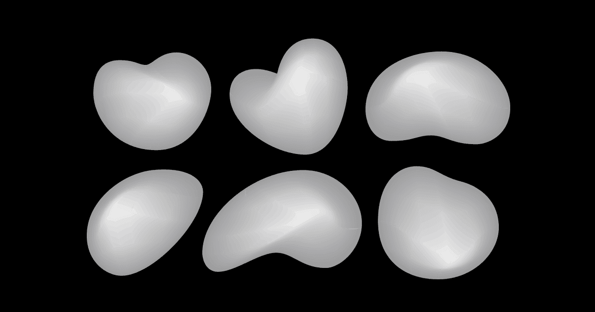
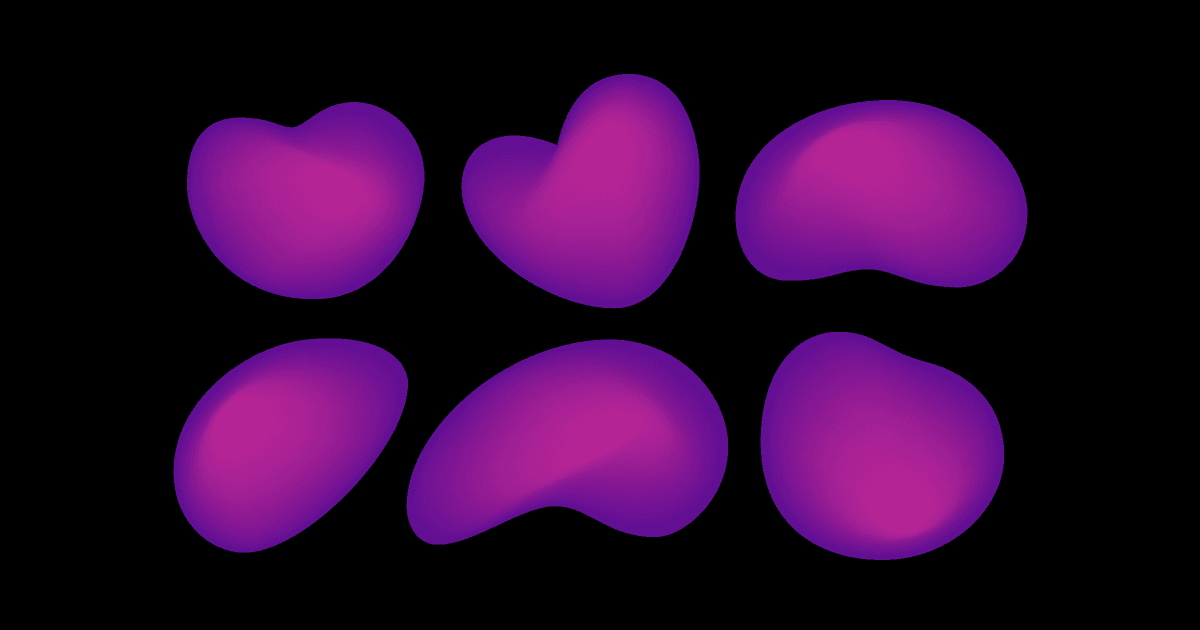
Creating the organic shapes:
I experimented scratching, brushing, and rolling ink directly onto paper. I wanted to achieve something which I would digitalise, but still felt handmade.
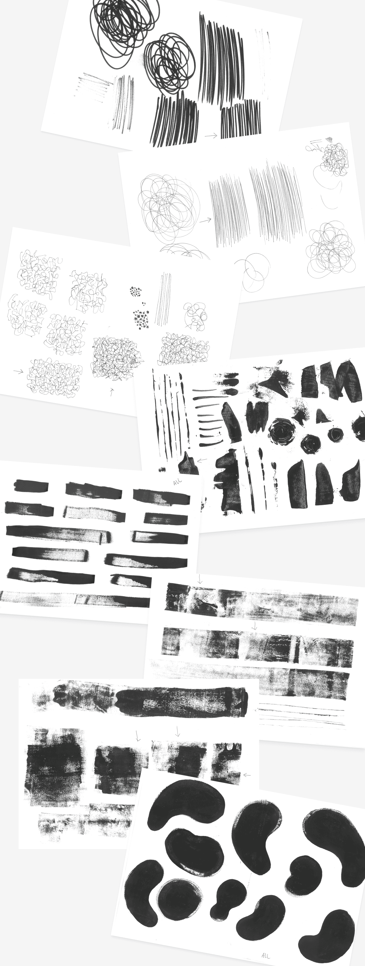
I was happy with the textures, but felt it was still lacking overall shape. I was then inspired by the famous Rorschach test and began folding ink blotches into paper.
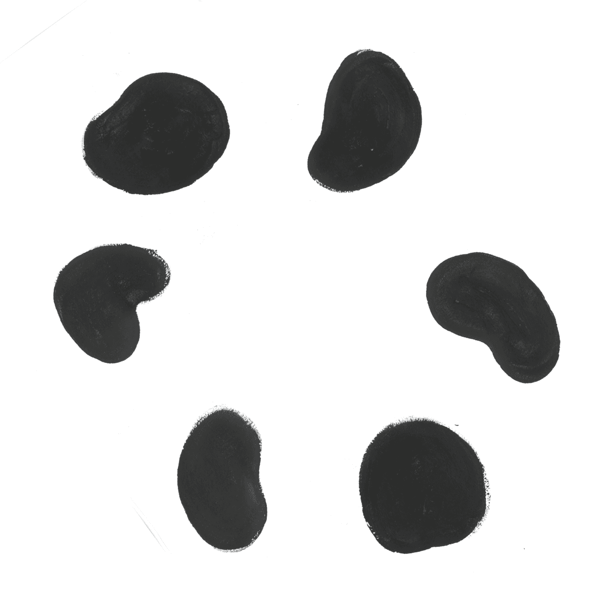
I proceeded with my collection of impromptu blobs to work more deeply into them digitally and give them individual curvatures.
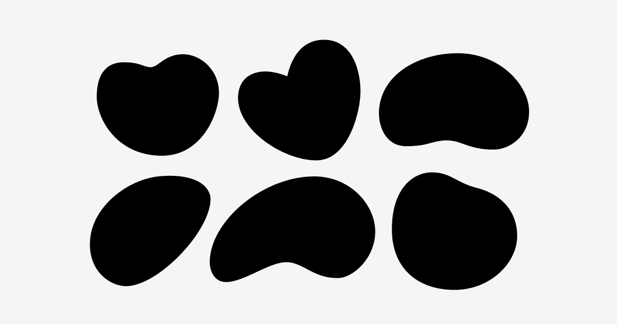
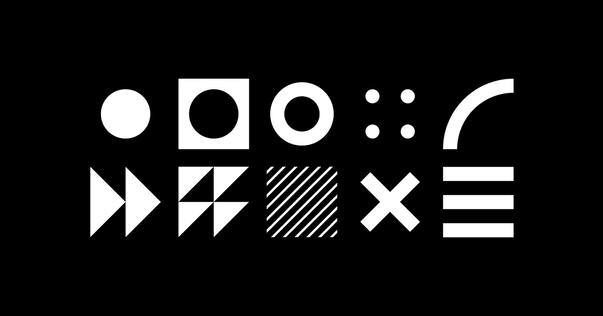
Creating the digital shapes:
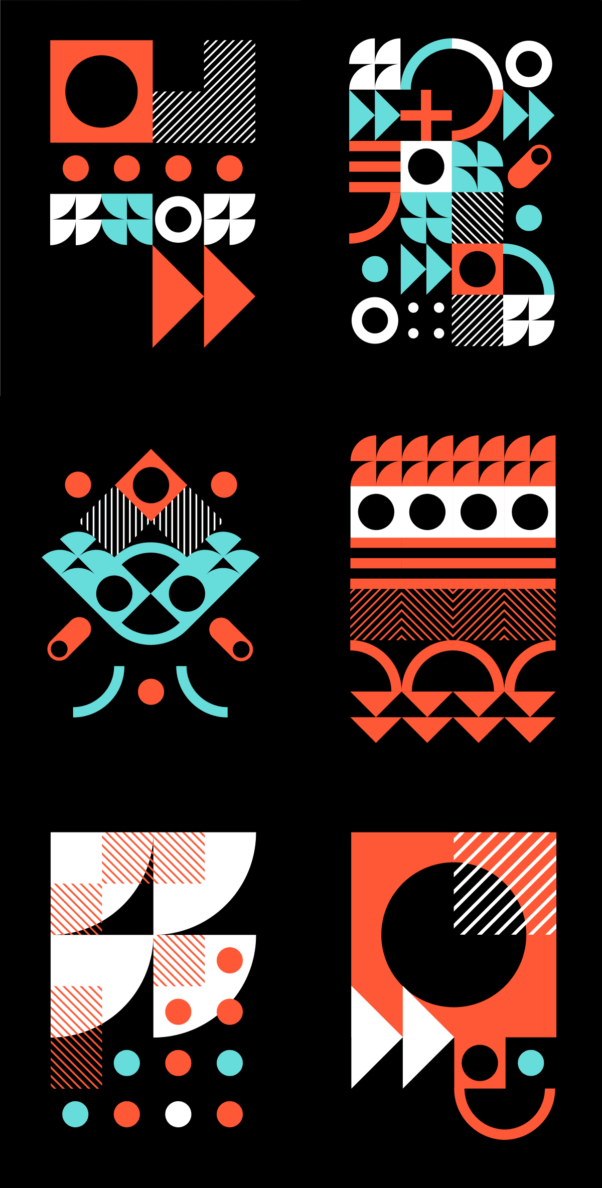
To counteract the playfulness of the organic shapes, I developed a heavier contrast to complete the visual language. To achieve this I created a set of brutalist modular shapes that each represented an icon relating to technology. As TNW would need a lot of assets, the shapes could be rearranged in various sequences and scales to be repurposed in high variety.
Shape pairings and experimentation of modular execution
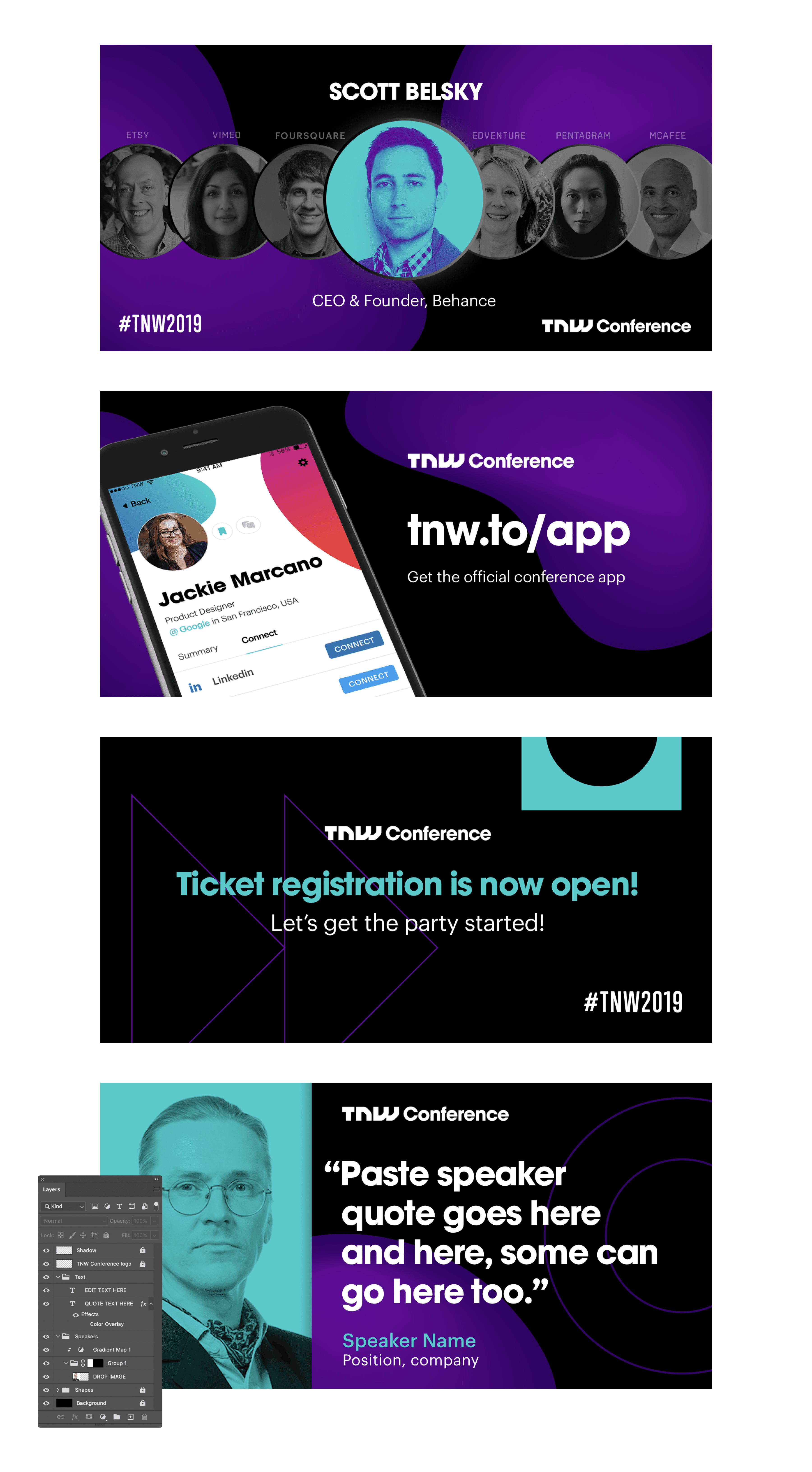
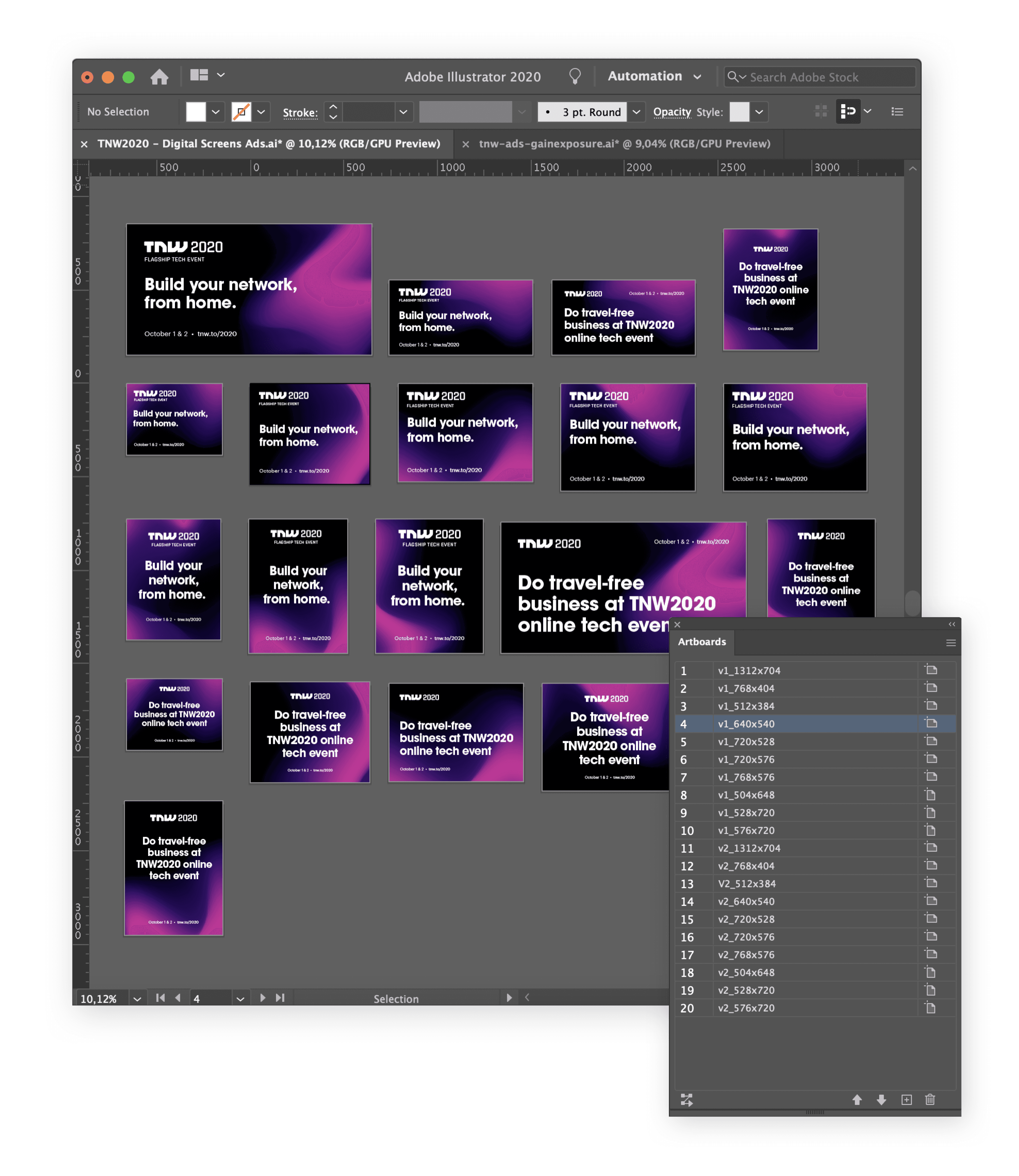
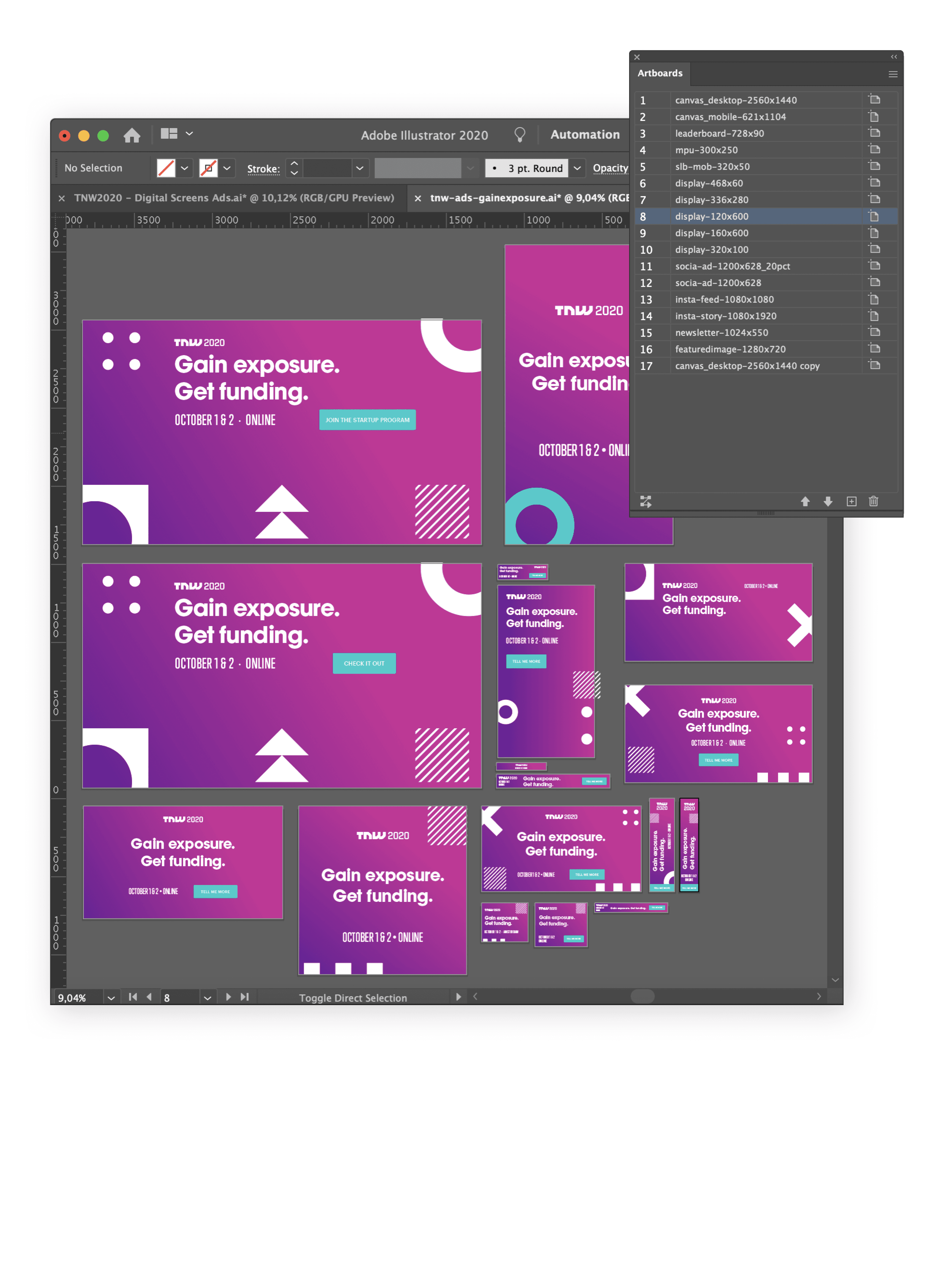
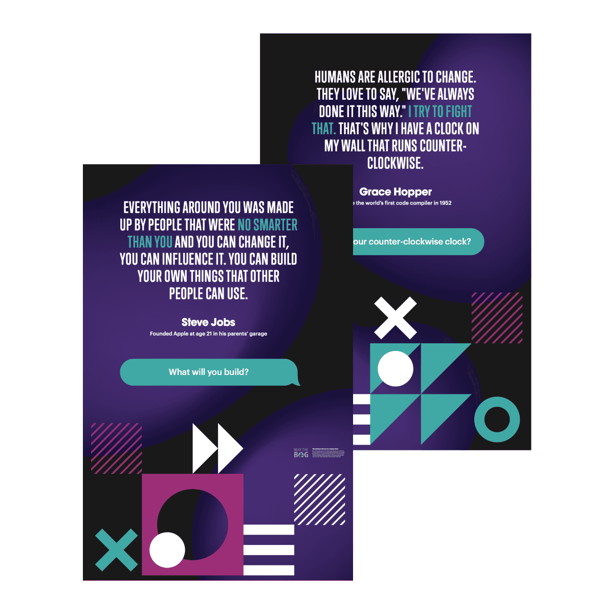
Building the social Assets
Now with our colour palette, illustrations, and vectorized shapes approved, I could begin creating the necessary social assets. I made neatly organised Photoshop templates for both the Design and Marketing teams to post quickly throughout the events days. Here are a handful to demonstrate executing the new brand.
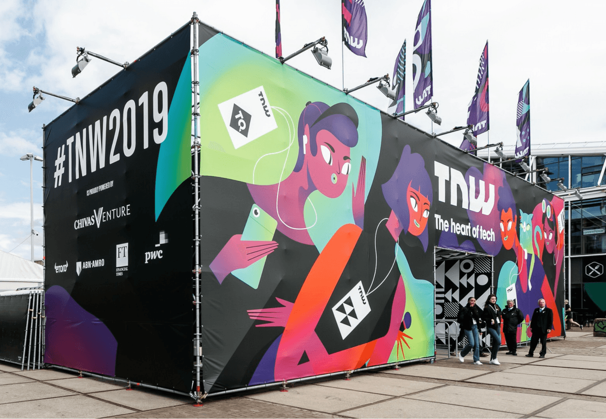
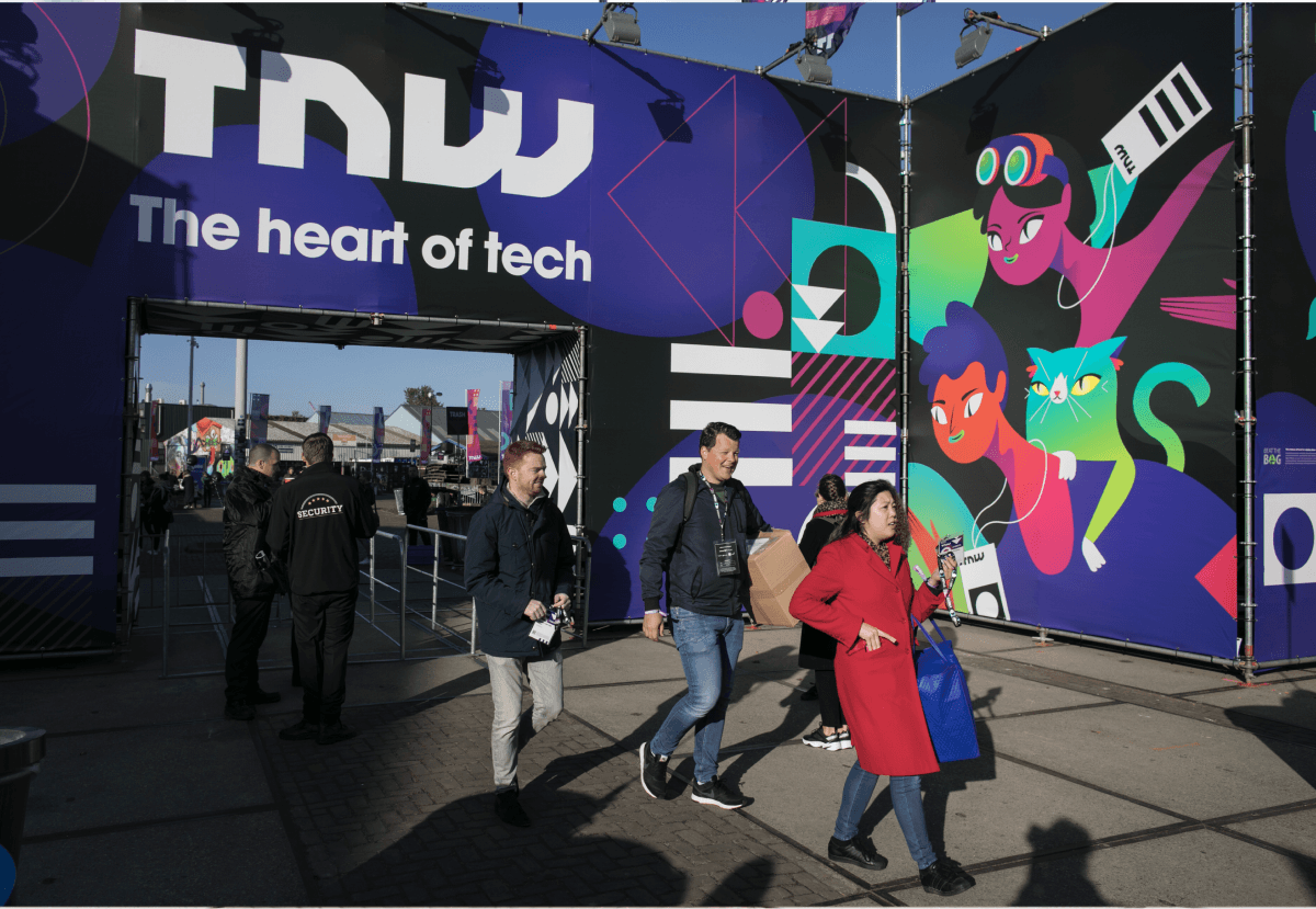
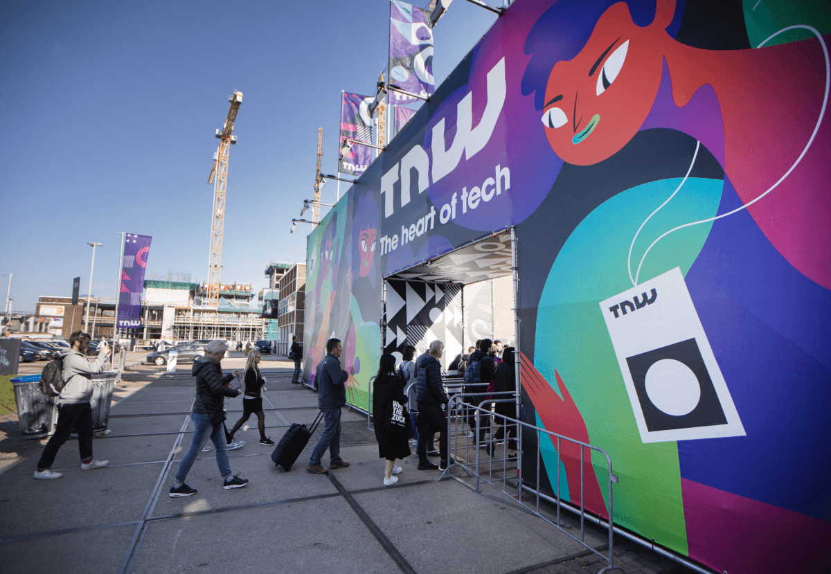
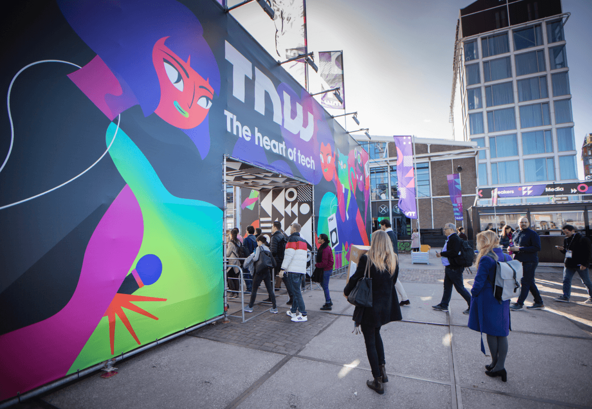
The entrance played a huge role in revealing TNW’s rebrand
It had to incorporate everything I set out to achieve as this would be the very first thing visitors would see when arriving at the conference. Boasting 10 metres high I took careful consideration designing each panel so every viewable angle celebrated TNW’s identity.
The outcome expanded TNW’s brand recognition with future proofed design assets.
The illustrations have become a staple to their branding and despite their acquisition (The Financial Times) my illustrations and visual language continued to be repurposed to breathe life into their many events both online and offline.
© Ashley Evans 2024